| ERLANDSEN DATA CONSULTING |
Excel & VBA Tips
|
These pages are no longer updated and are only available for archive purposes.
Click here to visit the pages with updated information.
Chart Examples
- Display tasks with a chart
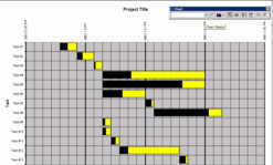
Enter information about each resource that is supposed to do a specific task, and the dates each task is supposed to be done. You may add information about how much of each task that is completed (in percent). The tasks are displayed in a "chart" similar to a Gantt-chart.
The chart can be scaled to display days, weeks or months.

Click here to download this tool.
Updated: 2006-05-10 Requires: XL97 File size: 51 kB Protected project
- Create charts for probability distribution
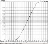
This addin creates simple "charts" for probability distribution (log-normal chart).
The "charts" uses an Y-axis with a scale that follows a normal probability distribution.
You can select a linear or logarithmic scale on the X-axis. Data that usually would be displayed as a normal bell-shaped curve will be displayed as a straight line in this "chart".
This tool does not use the built-in chart functions in Excel, but creates it's own "chart" on a worksheet.
Thanks to Joseph T. Forrest for valuable input and beta testing.

Click here to download this tool.
Updated: 2003-04-07 Requires: XL97 File size: 99 kB Protected project
- Planning chart example
This workbook shows how you can create a simple planning chart without the use of any macro programming.
The Gantt-like chart is created by using the conditional formatting feature.

Click here to download this example.
Updated: 2002-04-02 Requires: XL97 File size: 32 kB
- Gantt chart example
Create simple project plans, display tasks with a Gantt chart.

Click here to download this example.
Updated: 2000-08-08 Requires: XL97 File size: 21 kB
- Day planner
Fill inn who is supposed to perform a task at which day and time, display the tasks for each day in a chart. Similar to the Gantt chart example.
Click here to download this example.
Updated: 2000-08-08 Requires: XL97 File size: 24 kB
- Dynamic chart example
Chart example that plots the latest 12 months of data. Uses formulas only, no macro programming.
Click here to download this example.
Updated: 2000-08-08 Requires: XL5 File size: 54 kB
- Dynamic chart example
Chart example that expands according to the data that is being added.
Click here to download this example.
Updated: 2000-08-08 Requires: XL5 File size: 111 kB
- Timelines and project plans
Create simple project plans, with chart.
Very similar to the newer Planning Chart Example on this page.
Click here to download this example.
Updated: 2000-08-08 Requires: XL97 File size: 27 kB
Document last updated 2006-05-10 14:00:42 Printerfriendly version
| User comments: |
| Ole P. from Norway wrote (2004-10-29 11:52:55 CET): |
|
Re: Gantt Chart Example There is no built-in support for the functionality you want to include in the chart. It would be possible to add such functionality using macros. You can manually apply the necessary color codes after you have updated the chart, this formatting will disappear the next time the chart is updated. |
| Matthew Selbie from Kuala Lumpur , Malaysia wrote (2004-10-29 06:51:10 CET): |
|
Gantt Chart Example Thanks for this chart, it has saved me a lot of time. My question is how could the bars be colour coded so that the person responsible is identified OR how could you add the person responsible name at the end of the bar. The spreadsheet has a facility to enter a person but I don't know how to set this up Again thanks for this |
|
Erlandsen Data Consulting
http://www.erlandsendata.no/
Excel & VBA Tips Copyright ©1999-2025 Ole P. Erlandsen All rights reserved 
|